JUSTKA
AI Chatbot SaaS
JUSTKA
AI Chatbot SaaS
JUSTKA
AI Chatbot SaaS
Redesigned the chatbot platform, driving 766% more traffic, improving answer accuracy to 86%, and saving teams time with a reusable design system
Redesigned the chatbot platform, driving 766% more traffic, improving answer accuracy to 86%, and saving teams time with a reusable design system
Redesigned the chatbot platform, driving 766% more traffic, improving answer accuracy to 86%, and saving teams time with a reusable design system
Product
SaaS / Conversational AI
Role
UI/UX Designer
Timeline
Oct, 2019 ~ Mar, 2022
Team
UI/UX Designer x1 (My Role), Graphic Designer x1, Project Manager x2, Front-End Developer x2, Back-End Developer x2, AI Developer x3
JUSTKA AI Chatbot SaaS
JUSTKA AI Chatbot SaaS
JUSTKA AI Chatbot SaaS
JUSTKA AI Chatbot SaaS
JUSTKA AI Chatbot SaaS
JUSTKA AI Chatbot SaaS
JUSTKA AI Chatbot SaaS
JUSTKA AI Chatbot SaaS
JUSTKA AI Chatbot SaaS
Context
What is JustKa and why it matters
Back in early 2020, the chatbot industry was starting to gain real momentum. Most bots at the time were built around static, preset answers, and the idea of predicting user intent using advanced AI was still emerging. Businesses wanted smarter, more natural interactions, but the tools weren’t quite there yet.
That’s where JustKa AI came in. It’s a no-code SaaS platform that helps companies create intelligent, conversational chatbots powered by Retrieval-Augmented Generation (RAG). JustKa made it possible for businesses to streamline customer service, marketing, and sales by managing conversations across platforms like Facebook and LINE from one central place. It promised a smoother, more unified user experience, without the need for technical skills.
Why the platform needed a redesign
The team realized that if JustKa was going to meet the needs of growing businesses, the platform had to be more approachable and easier to use.
The setup process was confusing:
Corporate clients had to train the AI to understand user's intent, but the interface was complex and unintuitive. New users found themselves overwhelmed, especially during the setup stage.
Non-technical users felt left out:
Marketing and support staff were key users, but the system was too technical for them to navigate confidently. Without a background in tech, they struggled to even get started.
Non-technical users felt left out:
Marketing and support staff were key users, but the system was too technical for them to navigate confidently. Without a background in tech, they struggled to even get started.
Non-technical users felt left out:
Marketing and support staff were key users, but the system was too technical for them to navigate confidently. Without a background in tech, they struggled to even get started.
User frustration affected retention:
The poor usability led to lower satisfaction, longer setup times, and in some cases, clients walking away. It became clear that the design wasn’t just a UI issue, it was a business risk.
User frustration affected retention:
The poor usability led to lower satisfaction, longer setup times, and in some cases, clients walking away. It became clear that the design wasn’t just a UI issue, it was a business risk.
User frustration affected retention:
The poor usability led to lower satisfaction, longer setup times, and in some cases, clients walking away. It became clear that the design wasn’t just a UI issue, it was a business risk.

Too complex to train your chatbot?
Too complex to train your chatbot?
My Task
Revamped JustKa’s core feature, aiming to turn JustKa into a powerful yet accessible platform that anyone could use, no matter their background
Results
Impact
Traffic:
Traffic:
Monthly Traffic
Monthly Traffic
766%
766%
The previous version averaged 222.5 monthly visits (Dec 2020–Mar 2021)
The revamped version averaged 1,926.6 monthly visits (Apr–Oct 2021)
The previous version averaged 222.5 monthly visits (Dec 2020–Mar 2021)
The revamped version averaged 1,926.6 monthly visits (Apr–Oct 2021)
The previous version averaged 222.5 monthly visits (Dec 2020–Mar 2021)
The revamped version averaged 1,926.6 monthly visits (Apr–Oct 2021)
Accuracy:
Accuracy:
Response accuracy
Response accuracy
86%
86%
Significantly improving the QA knowledge base.
Significantly improving the QA knowledge base.
Intuitive Chatflow Builder: (Clients' Feedback)
Intuitive Chatflow Builder: (Clients' Feedback)
Building conversation flows is very intuitive.
Building conversation flows is very intuitive.
Building conversation flows is very intuitive.
The chatbot supports multimodal presentations.
The chatbot supports multimodal presentations.
The chatbot supports multimodal presentations.
Allows for extensive customization features.
Allows for extensive customization features.
Allows for extensive customization features.
Seamless Multi-Platform Integration: (Clients' Feedback)
Seamless Multi-Platform Integration: (Clients' Feedback)
Consolidates scattered social media channels, making management highly convenient.
Consolidates scattered social media channels, making management highly convenient.
Consolidates scattered social media channels, making management highly convenient.
Aggregates data from multiple platforms, enabling comprehensive analysis and insights.
Aggregates data from multiple platforms, enabling comprehensive analysis and insights.
Aggregates data from multiple platforms, enabling comprehensive analysis and insights.
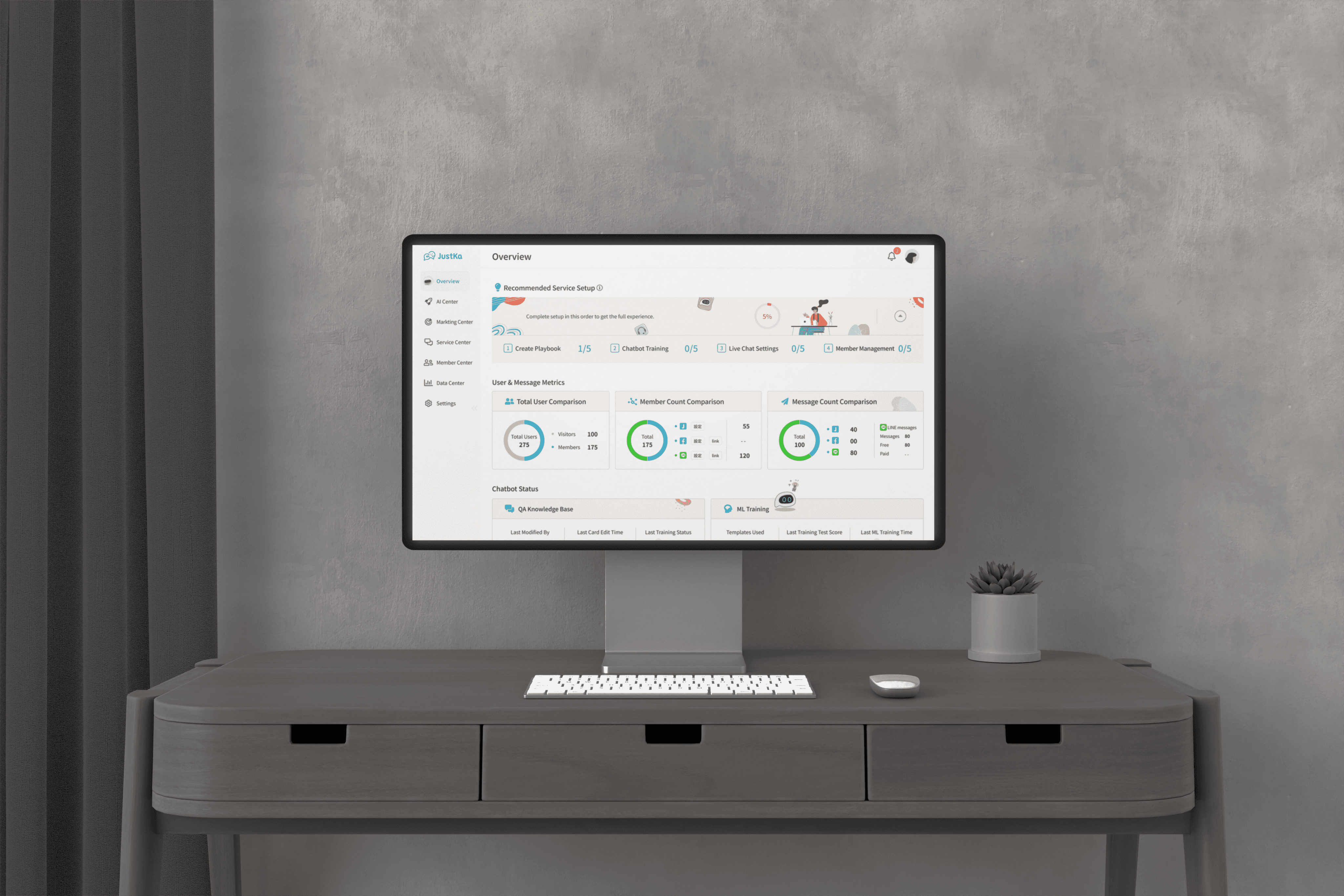
Before
The Previous Version:
When I first looked at the platform, it was clear why users were struggling. The three key features (Category Management, Vocab Settings, and Intent Templates) were each placed on separate pages, making the chatbot training process feel fragmented.
There was no clear path to guide users through the chatbot training process, and it often felt like jumping between disconnected tools. Many users found themselves lost or unsure of what to do next, even when trying to complete simple tasks.
After
The Solution:
To simplify the experience, I combined the three core functions into a single, streamlined page and reworked the overall workflow. This made chatbot training much more intuitive, especially for corporate clients who previously struggled with the complexity.
The Solution:
To simplify the experience, I combined the three core functions into a single, streamlined page and reworked the overall workflow. This made chatbot training much more intuitive, especially for corporate clients who previously struggled with the complexity.
The Solution:
To simplify the experience, I combined the three core functions into a single, streamlined page and reworked the overall workflow. This made chatbot training much more intuitive, especially for corporate clients who previously struggled with the complexity.
But it wasn’t just about combining features on one page. I gathered user needs, clarified the core purpose, refined the user flow, and worked closely with developers to understand how the AI training logic actually worked. Then, I tested and validated the new approach through collaboration and iteration.
But it wasn’t just about combining features on one page. I gathered user needs, clarified the core purpose, refined the user flow, and worked closely with developers to understand how the AI training logic actually worked. Then, I tested and validated the new approach through collaboration and iteration.
But it wasn’t just about combining features on one page. I gathered user needs, clarified the core purpose, refined the user flow, and worked closely with developers to understand how the AI training logic actually worked. Then, I tested and validated the new approach through collaboration and iteration.
After
After
Journey to the Solution
Journey to the Solution
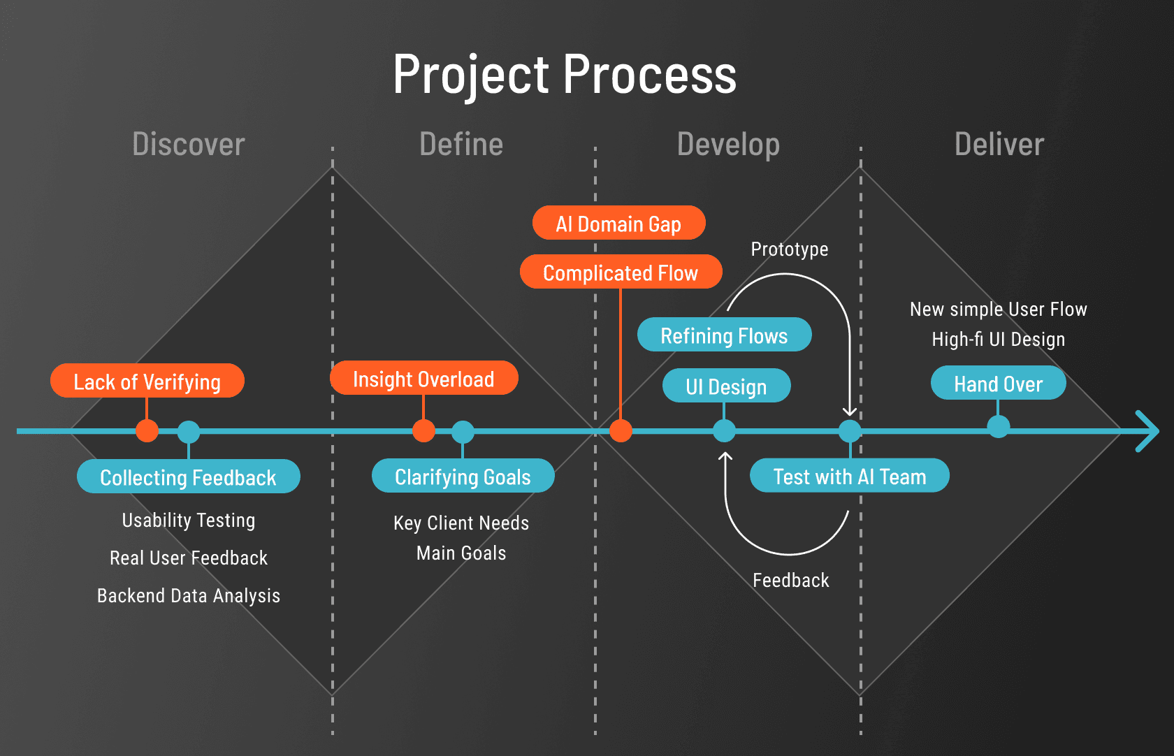
Discover
Challenge - Lack of Verifying
Early in the discovery phase, I noticed a major gap—there had been no usability testing to validate the chatbot experience. There was also no data on how users interacted with the platform.
Without visibility into user behavior or pain points, it was difficult to make informed design decisions. I knew we needed real insights to guide the redesign.
Solution - Collecting Feedback
To truly understand what was holding users back, I knew we needed more than just assumptions. I came up with three ways to gather meaningful insights: usability testing, direct client feedback, and backend data analysis.
To truly understand what was holding users back, I knew we needed more than just assumptions. I came up with three ways to gather meaningful insights: usability testing, direct client feedback, and backend data analysis.
To truly understand what was holding users back, I knew we needed more than just assumptions. I came up with three ways to gather meaningful insights: usability testing, direct client feedback, and backend data analysis.
Usability Testing:
I started by running usability tests with the project manager using the older version of the platform. My goal was to uncover how users actually interacted with the product and where they struggled the most.
I started by running usability tests with the project manager using the older version of the platform. My goal was to uncover how users actually interacted with the product and where they struggled the most.
I started by running usability tests with the project manager using the older version of the platform. My goal was to uncover how users actually interacted with the product and where they struggled the most.
SUS Result:
To measure the overall experience, I used the System Usability Scale (SUS), and the results weren’t great, the average score from four participants was just 60.6 out of 100, which indicated clear usability issues.
SUS Result:
To measure the overall experience, I used the System Usability Scale (SUS), and the results weren’t great, the average score from four participants was just 60.6 out of 100, which indicated clear usability issues.
SUS Result:
To measure the overall experience, I used the System Usability Scale (SUS), and the results weren’t great, the average score from four participants was just 60.6 out of 100, which indicated clear usability issues.
Major problems that came up included:
Users couldn’t easily locate their uploaded vocabulary.
Users were confused about the three main features and couldn’t tell what each one was supposed to do.
The interface lacked helpful hints or guidance, leaving users unsure of what to do next.
Major problems that came up included:
Users couldn’t easily locate their uploaded vocabulary.
Users were confused about the three main features and couldn’t tell what each one was supposed to do.
The interface lacked helpful hints or guidance, leaving users unsure of what to do next.
Major problems that came up included:
Users couldn’t easily locate their uploaded vocabulary.
Users were confused about the three main features and couldn’t tell what each one was supposed to do.
The interface lacked helpful hints or guidance, leaving users unsure of what to do next.

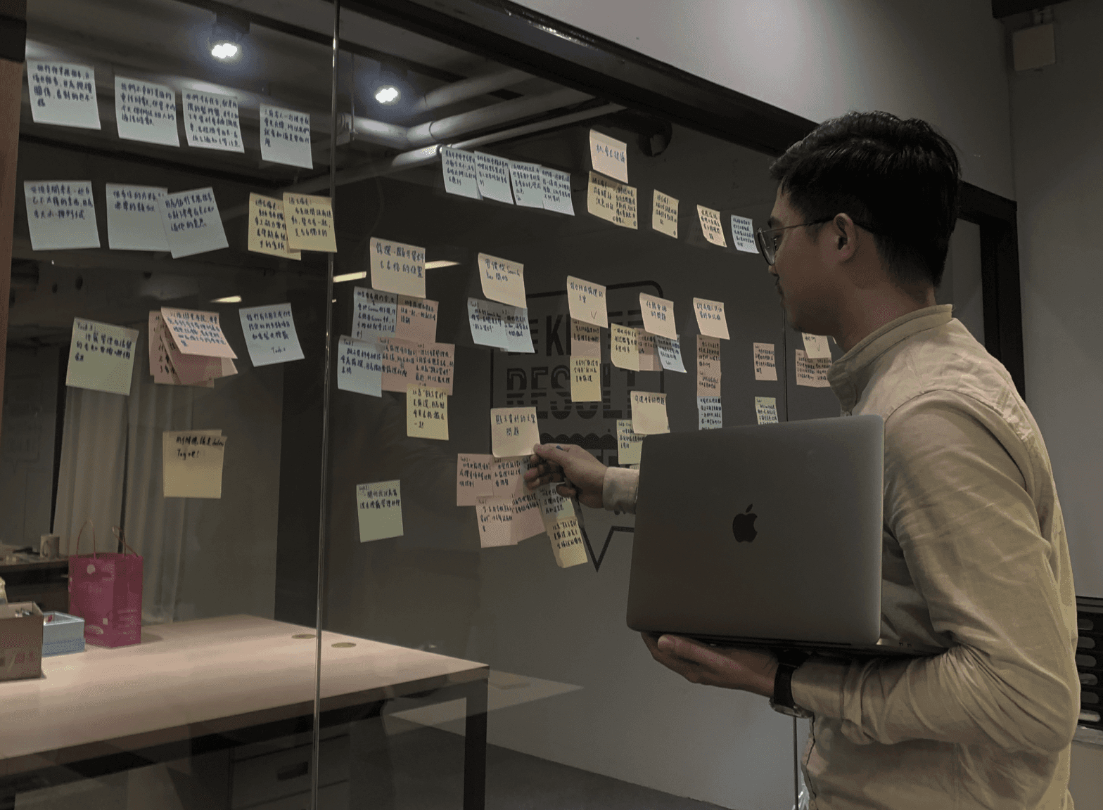
Usability Testing and Affinity Mapping Session
Real User Feedback:
In addition to testing, I reached out to our corporate clients to hear directly from the people using the platform in real scenarios.
In addition to testing, I reached out to our corporate clients to hear directly from the people using the platform in real scenarios.
Their feedback highlighted a few key pain points:
The three functions were placed on separate pages, making the process confusing.
The interactions were complex, and users hoped for simplification.
Users hoped to train the AI once and have it update consistently across different social media channels.
Backend Data Analysis:
To round out the picture, I collaborated with our developer to look at internal performance metrics. We focused on two areas: response accuracy and the time users spent training their chatbots.
To round out the picture, I collaborated with our developer to look at internal performance metrics. We focused on two areas: response accuracy and the time users spent training their chatbots.
To round out the picture, I collaborated with our developer to look at internal performance metrics. We focused on two areas: response accuracy and the time users spent training their chatbots.
Here's what we found:
The response accuracy couldn’t exceed 70%, falling short of expectations.
Users were spending twice as long as expected to build and train their vocabularies.
Here's what we found:
The response accuracy couldn’t exceed 70%, falling short of expectations.
Users were spending twice as long as expected to build and train their vocabularies.
Here's what we found:
The response accuracy couldn’t exceed 70%, falling short of expectations.
Users were spending twice as long as expected to build and train their vocabularies.
Define
Challenge - Insight Overload
Aside from the major pain points mentioned earlier, we uncovered a wide range of valuable insights from usability testing, corporate users, and internal stakeholders.
However, with limited time and a small team, it wasn’t realistic to tackle everything at once. We had to carefully prioritize our efforts and focus on the issues that would have the greatest impact on both user experience and business value.
Early in the discovery phase, I noticed a major gap—there had been no usability testing to validate the chatbot experience. There was also no data on how users interacted with the platform.
Without visibility into user behavior or pain points, it was difficult to make informed design decisions. I knew we needed real insights to guide the redesign.
Solution - Clarifying Goals
Easy to set up
Easy to set up
How might we simplify the AI training setup flow so that even new users can complete it without confusion?
Smarter Vocabulary Training
Smarter Vocabulary Training
How might we help corporate clients train the chatbot to better understand prompts in different contexts through more effective vocabulary setting?
Unified Multi-Channel Updates
Unified Multi-Channel Updates
How might we help users update their training content across multiple social media channels with one click, so they can manage everything more efficiently?
Develop
Challenge - AI Domain Gap
While working on the project, I sometimes wasn’t sure if my design decisions aligned with how the AI training actually worked. I understood the user experience side, but the technical logic behind the chatbot felt unclear.
I realized I needed input from AI experts to make sure the flow made sense both for users and for the system.
Early in the discovery phase, I noticed a major gap—there had been no usability testing to validate the chatbot experience. There was also no data on how users interacted with the platform.
Without visibility into user behavior or pain points, it was difficult to make informed design decisions. I knew we needed real insights to guide the redesign.
Solution - Collaborating with AI Team
To close the gap, I actively worked with the AI developers, asking questions, evaluating feasibility, and trying to understand how the training process actually worked.
I learned that training an AI is a bit like teaching a child, you need to start with the basics and build up. For our product, we should follow this step-by-step process:

This insight helped me realize that guiding users to set up the three key features in a logical, step-by-step order would not only simplify the experience but also align better with how the AI learns.
Challenge - Complicated Flow
The 3 key features had a sequential relationship, but in the previous version, they were scattered across different locations, making it difficult for users to follow the proper setup order.
Early in the discovery phase, I noticed a major gap—there had been no usability testing to validate the chatbot experience. There was also no data on how users interacted with the platform.
Without visibility into user behavior or pain points, it was difficult to make informed design decisions. I knew we needed real insights to guide the redesign.
What did the previous UI flows look like?
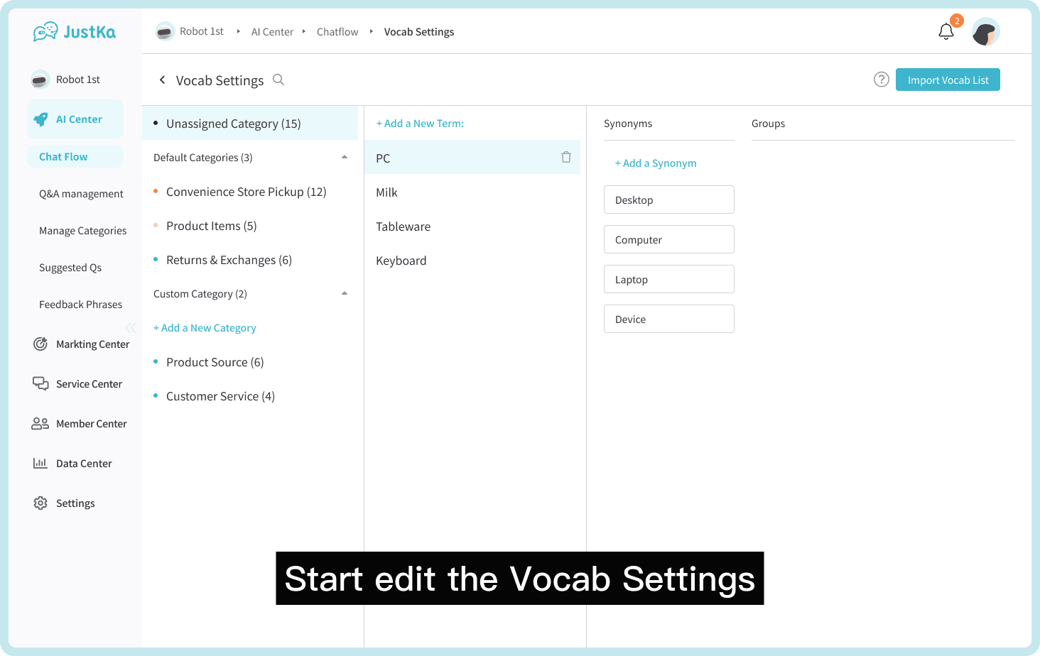
First Feature: Vocab Settings
Users need to add and categorize vocabulary and related terms to train the chatbot to understand user language more naturally.
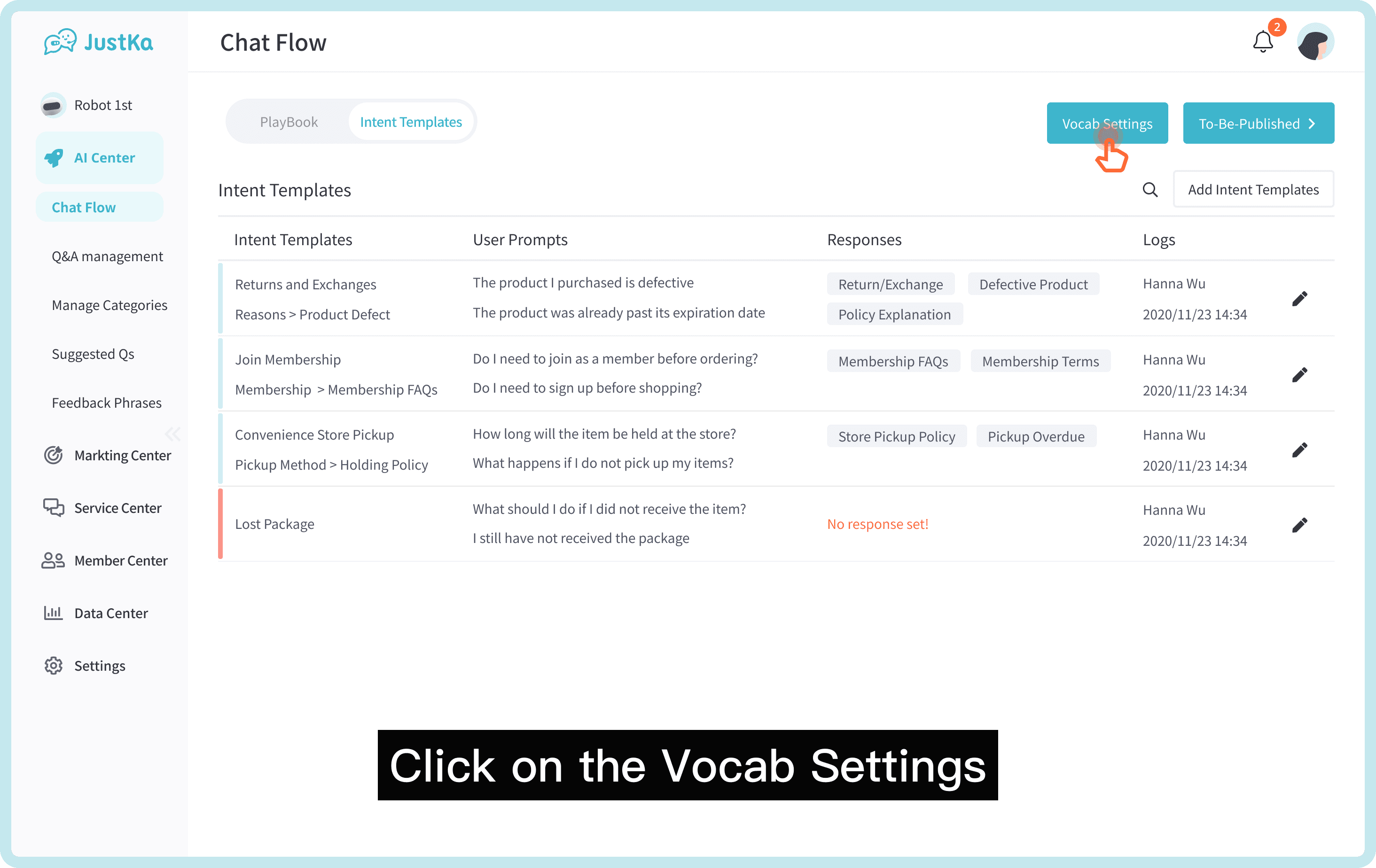
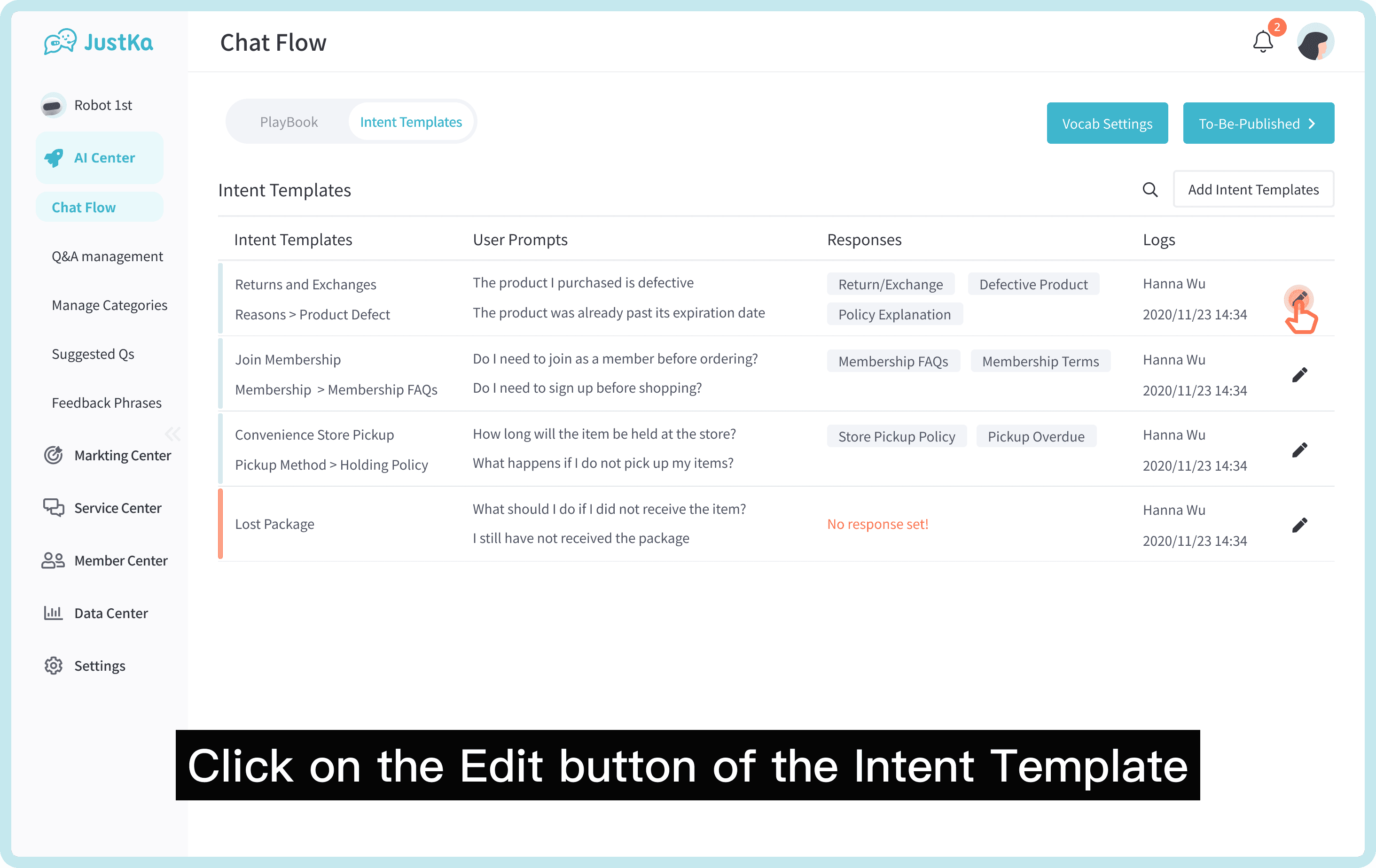
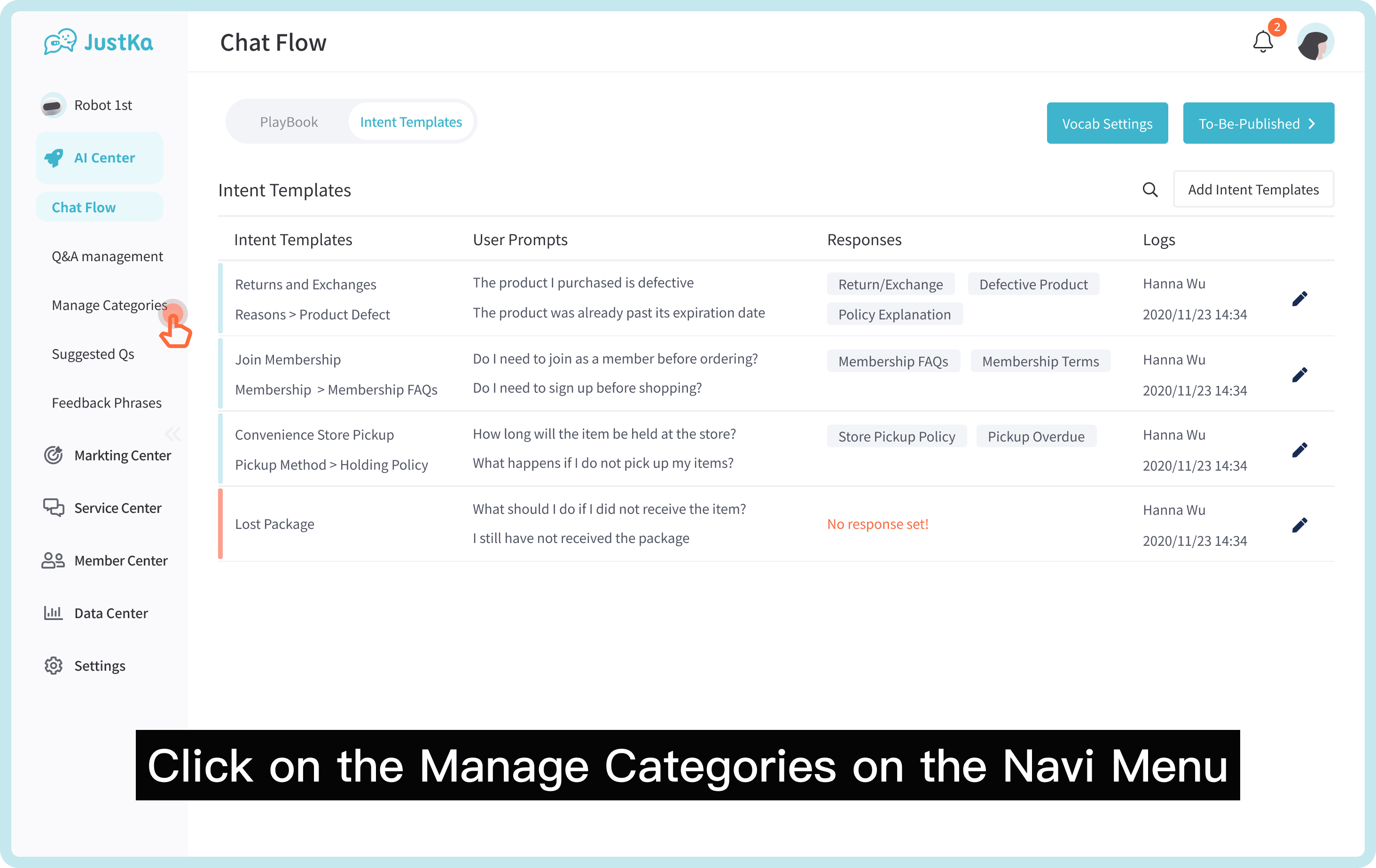
Second Feature: Intent Templates
Input potential prompts and vocabulary in the Intent Templates to train the chatbot to understand related intents and terms.

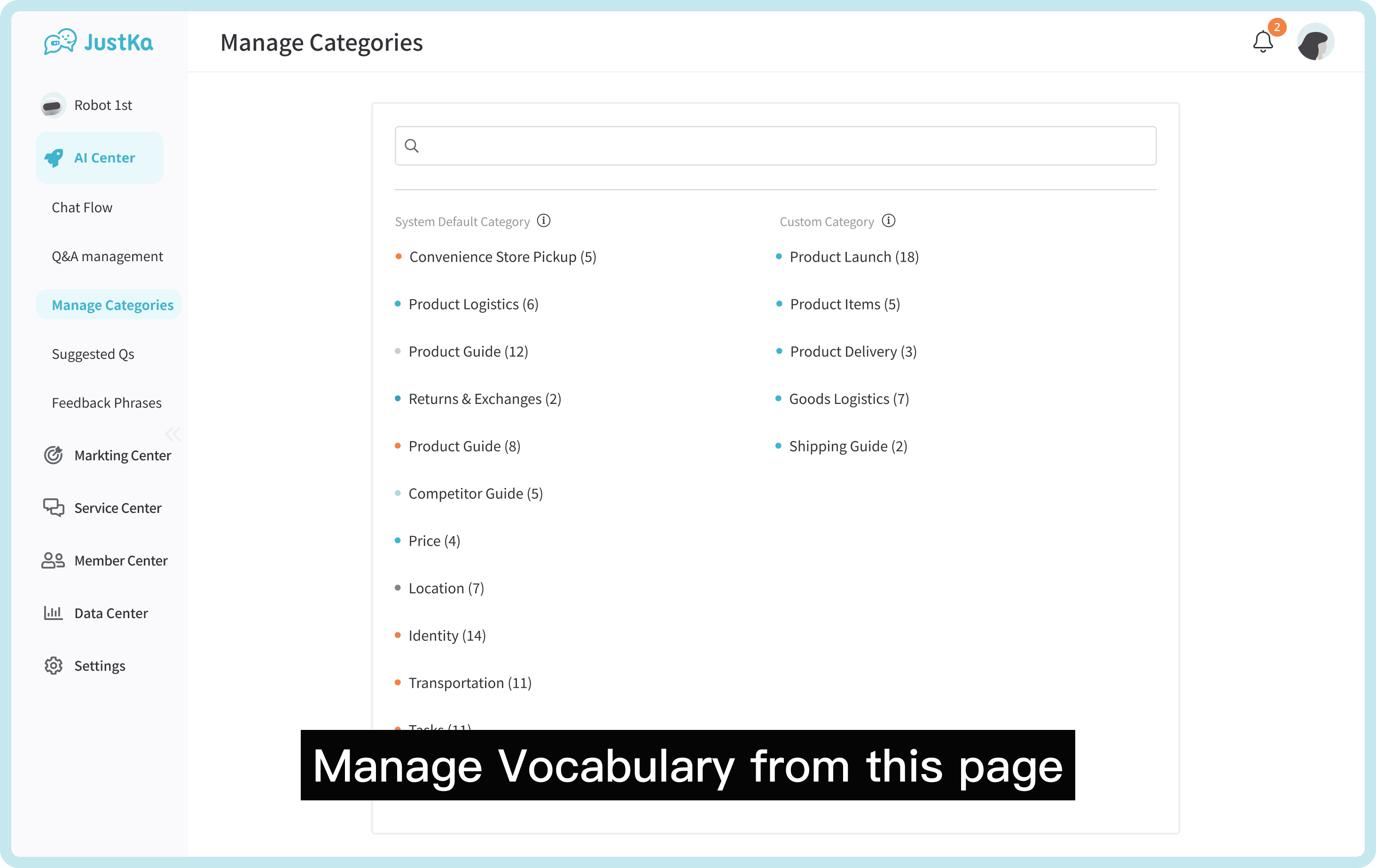
Third Feature: Category Management
Manage vocabulary categories to ensure users have all the necessary groups in place.
Solution - Refining Flows
To address the flow issues and because there were no existing flowcharts in the previous version, I started by creating new flowcharts to clarify the relationship between the three features and eliminate overlapping pages.
This made it easier to connect them without causing confusion.
Early in the discovery phase, I noticed a major gap—there had been no usability testing to validate the chatbot experience. There was also no data on how users interacted with the platform.
Without visibility into user behavior or pain points, it was difficult to make informed design decisions. I knew we needed real insights to guide the redesign.
Final Flowcharts: Figma Link→
First Feature: Vocab Settings
Second Feature: Intent Templates
Third Feature: Category Management
As a result of removing the overlap, each feature now has a clear and focused role:
Vocab Settings is used for adding and organizing vocabulary and synonyms, Intent Templates is for adding and editing prompts for training, and Category Management is for managing category structures.
This clarity helps users understand exactly where to complete each task.
Early in the discovery phase, I noticed a major gap—there had been no usability testing to validate the chatbot experience. There was also no data on how users interacted with the platform.
Without visibility into user behavior or pain points, it was difficult to make informed design decisions. I knew we needed real insights to guide the redesign.
Solution - Prototypes
First Feature: Vocab Settings
The animation demonstrates how users can add vocabulary and synonyms, and how that information is stored within the platform.
The animation demonstrates how users can add vocabulary and synonyms, and how that information is stored within the platform.
Early in the discovery phase, I noticed a major gap—there had been no usability testing to validate the chatbot experience. There was also no data on how users interacted with the platform.
Without visibility into user behavior or pain points, it was difficult to make informed design decisions. I knew we needed real insights to guide the redesign.
Second Feature: Intent Templates
The animation shows how quickly users can train the chatbot by creating an intent template, and how the information is displayed in the template list.
The animation shows how quickly users can train the chatbot by creating an intent template, and how the information is displayed in the template list.
Early in the discovery phase, I noticed a major gap—there had been no usability testing to validate the chatbot experience. There was also no data on how users interacted with the platform.
Without visibility into user behavior or pain points, it was difficult to make informed design decisions. I knew we needed real insights to guide the redesign.
Third Feature: Category Management
The animation illustrates where the categories are stored and how they can be edited or deleted.
The animation illustrates where the categories are stored and how they can be edited or deleted.
Early in the discovery phase, I noticed a major gap—there had been no usability testing to validate the chatbot experience. There was also no data on how users interacted with the platform.
Without visibility into user behavior or pain points, it was difficult to make informed design decisions. I knew we needed real insights to guide the redesign.
Unified Multi-Channel
In response to user requests for multi-channel support gathered from the Real User Feedback, the product manager and I collaborated to find a simple solution. We gave users the flexibility to choose which channels to publish to, putting control directly in their hands.
In response to user requests for multi-channel support gathered from the Real User Feedback, the product manager and I collaborated to find a simple solution. We gave users the flexibility to choose which channels to publish to, putting control directly in their hands.
Early in the discovery phase, I noticed a major gap—there had been no usability testing to validate the chatbot experience. There was also no data on how users interacted with the platform.
Without visibility into user behavior or pain points, it was difficult to make informed design decisions. I knew we needed real insights to guide the redesign.
Behind the Scenes - Design System
While this case study focuses on how I solved key user problems, there was another major contribution I made behind the scenes. In 2020, I took the initiative to build a complete design system in Figma from the ground up—and continued evolving it throughout my time in the role.
I handled everything myself: designing, naming, and organizing each component to ensure the system was not only scalable and accessible, but also easy for cross-functional teams to use consistently.
This product had two main interface areas: the Admin Panel and the Instant Messaging Interface. The content I designed supported key functional areas such as:
Admin Panel
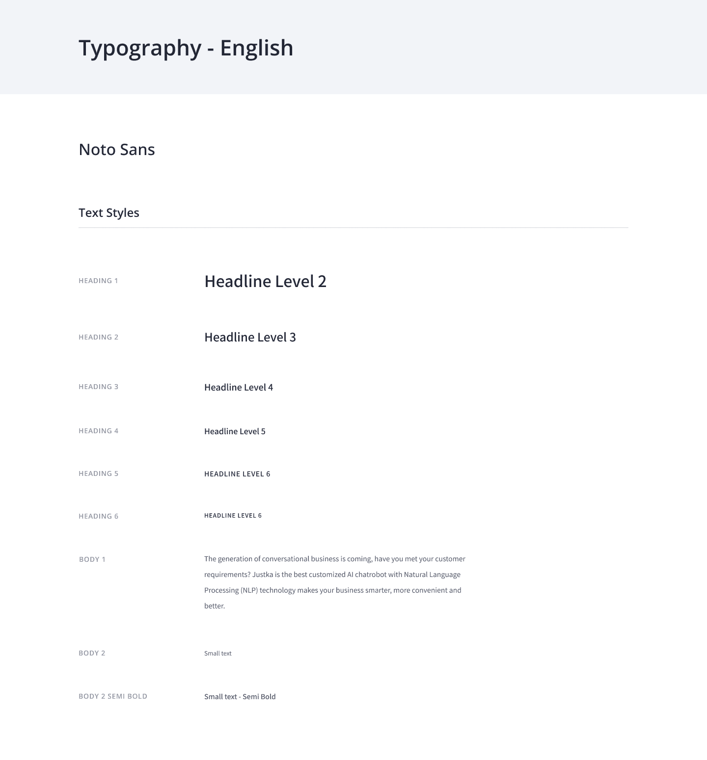

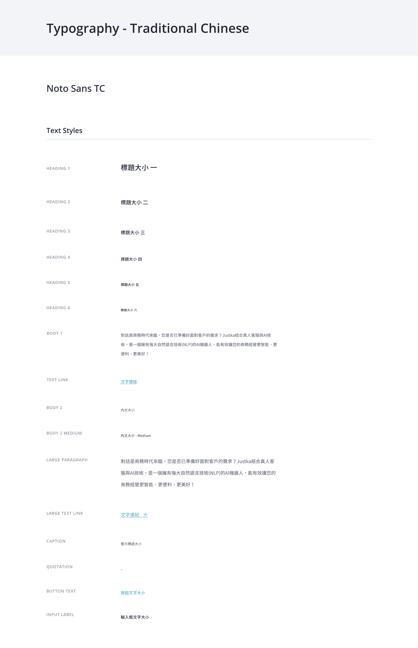
Typography
Typography
Typography
Colour
Icons
Buttons
Drop-downs & Search
Visual Assets
Components
Page Status
Navigation Menu
Typography
Colour
Icons
Buttons
Drop-downs & Search
Visual Assets
Components
Page Status
Navigation Menu
Instant Messaging Interface
Typography
Colour
Icons & Buttons
Components

Typography
Colour
Icons & Buttons
Components
Typography
Final Thoughts
Learning & Reflection

A Bittersweet Ending
Unfortunately, I wasn’t able to test the final design with users due to an unexpected company crisis. Half the design team was laid off, and while I wasn’t directly affected, I eventually decided to move on, as the company no longer felt like the right fit for me.
Even so, I was proud to see the new version go live. It led to a significant boost in monthly traffic, improved response accuracy, and received positive feedback from clients, clear signs that the work we did had real impact.
Collaborating with the Tech Team
Although I’ve worked on many redesign projects before, this one stood out because of its technical complexity. It was the first time I had to deeply engage with AI logic, and I spent a lot of time collaborating with the development team—asking questions, clarifying constraints, and working through multiple iterations.
It turned out to be the most technically challenging project I’ve ever taken on, and it taught me how important cross-functional communication is in AI-driven product design.

CONTACT

Ⓒ2024 Designed and Built by Jason Yang
CONTACT
Ⓒ2025 Designed by Jason Yang
CONTACT
Ⓒ2025 Designed by Jason Yang