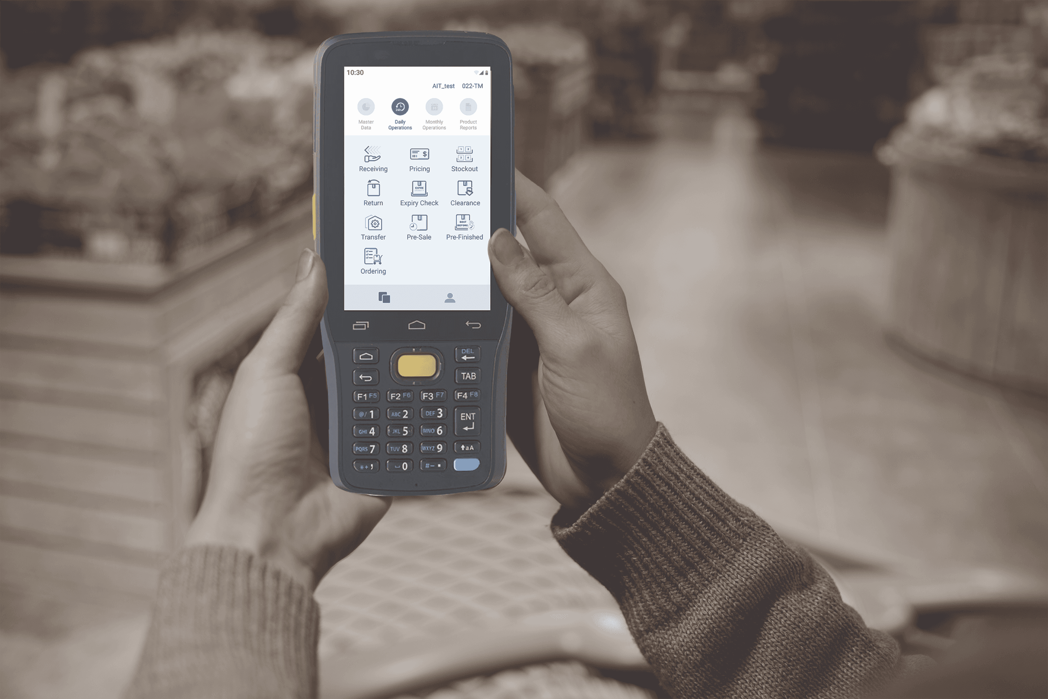
I redesigned Carrefour Taiwan’s PSI (Purchase, Sales, and Inventory) system, an Android operational tool used by store staff to manage purchasing, sales, inventory, product tags, returns, and in-store workflows. The redesign focused on simplifying repeated store tasks, improving workflow clarity, and creating reusable UI patterns for future PSI features.
Product
Android App
Role
Sole UI/UX Designer
Duration
9 months
Team
Key Outcome
Project Context
About the Product

Carrefour Taiwan’s PSI system is an Android-based operational tool that supports store staff in managing purchasing, sales, inventory, product tags, returns, and in-store workflows.
The system is used across Carrefour stores to support three key store operations:
Why Redesign?


Although Carrefour already had a PSI system, many daily store workflows still relied on manual tracking and paper-based processes. This slowed down inventory-related tasks and made it harder for staff to keep information accurate across hundreds of stores.
With rising operational, labour, and inventory management costs, Carrefour needed to digitalize these workflows and help staff complete routine tasks faster, with fewer errors.
Process
Key Challenges
Challenge 1: No Scalable Design Foundation
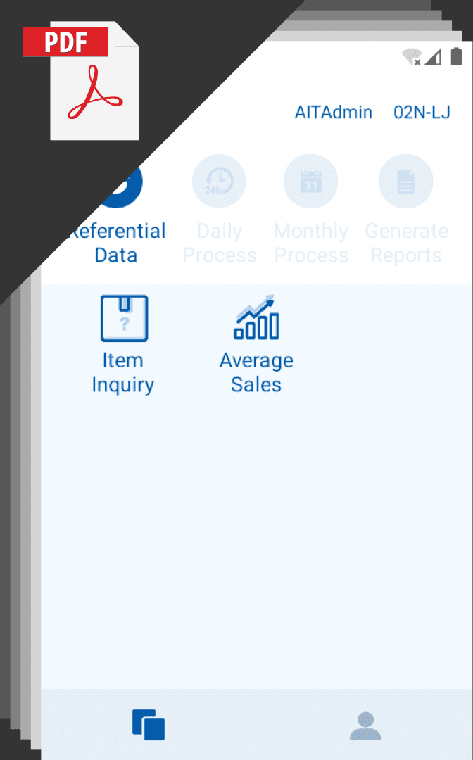
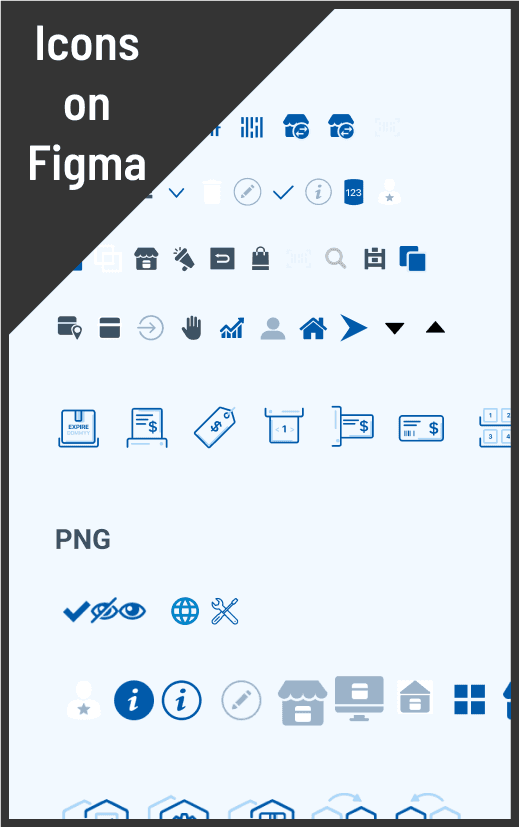
At the start of the project, the previous design files were difficult to continue from. Carrefour mainly had UI references in PDF format, and there was no unified guideline for typography, icons, buttons, or reusable components.
Design Response
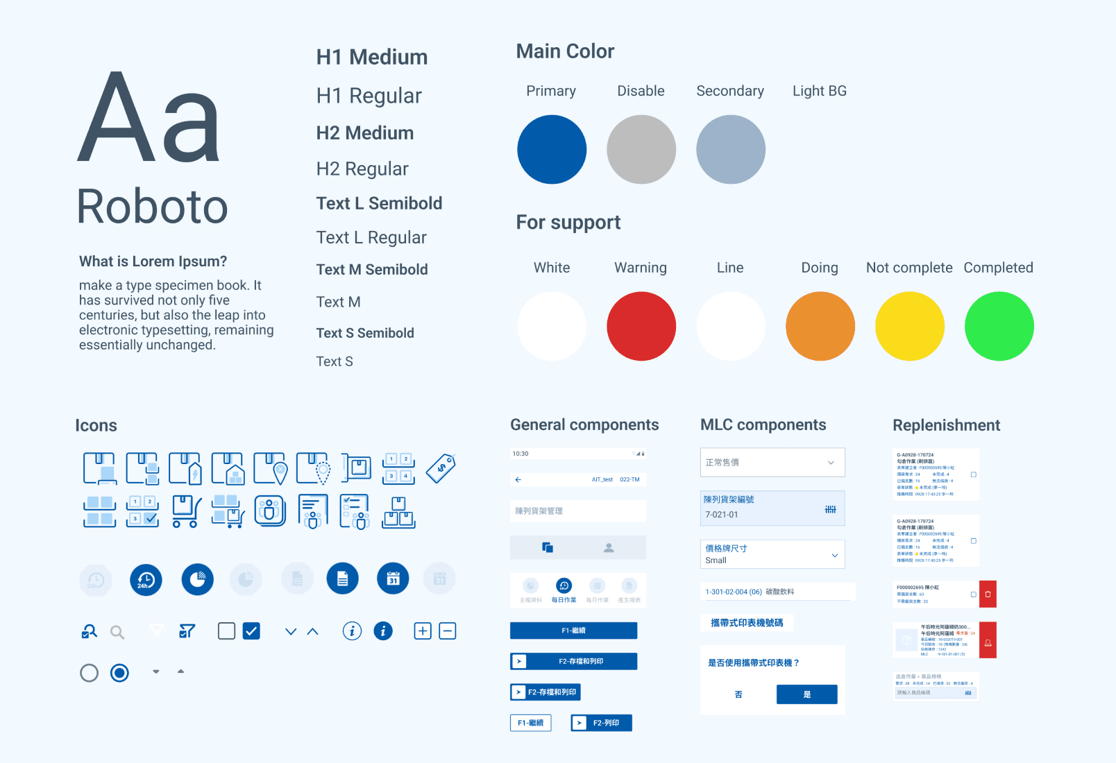
I reorganized the existing design assets and built a Figma design guideline to standardize UI patterns, making it easier to design future PSI features consistently.
Challenge 2: Key Workflows Were Buried Too Deeply
Frontline staff needed to access PSI functions quickly during daily store operations, but the original structure placed many tasks under multiple navigation layers. This made it harder for staff to find the right workflow quickly, especially when working on the sales floor or in storage areas.

Design Response
I explored three IA directions to reduce navigation layers and help frontline staff find key workflows faster. After reviewing the tradeoffs with the team, we chose Option 2: Combine Daily Tasks with Inventory Management.
Final Direction: Combine Daily Tasks with Inventory Management
FocuseThis option grouped daily tasks and inventory-related workflows together to better match how staff worked on the floor.
Pros:
It made related workflows easier to access while keeping the structure familiar enough for users and developers.
Potential issue:
It required team alignment because some existing function groups had to change.

Other option 1: Group by Current Function Content
This option kept the IA closest to the existing system structure.
Reasons didn't choose:
Some key workflows remained buried under extra navigation layers.
Other option 2: Rebuild Tabs and Landing Page
This option redesigned the homepage and tab structure to make frequent tasks more visible.
Reasons didn't choose:
It required the most redesign effort and development alignment.
Challenge 3: Paper-Based Task Assignment Slowed Down Store Operations
Design Response
I translated the paper-based assignment process into a digital workflow, allowing store staff to receive, review, and complete assigned tasks directly through the PSI system.
Final Design
Design Guideline
Product Tag Management Flow
Create New MLC Shelves
Impact
The redesigned PSI workflows reduced system processing time by 40% across 317 Carrefour stores in Taiwan.
The improved flows helped staff complete purchasing, sales, and inventory tasks more efficiently, while the design guideline created a more consistent foundation for future PSI feature
Key Outcomes
40% reduction in system processing time
317 stores supported across Taiwan
Standardized UI patterns for future PSI features
Improved consistency between design and development
Better support for repeated store operation tasks
Reflection
This project taught me the importance of designing for real operational environments, not just ideal user flows. Because store staff complete repeated tasks throughout the day, small UX improvements can create meaningful impact at scale.
I also learned that in enterprise projects, a strong design foundation is just as important as individual screens. Organizing Figma assets, standardizing UI patterns, and building reusable guidelines helped the team move faster and maintain consistency across a complex system.

